


In most organizations, processes live in people’s heads, passed down through repetition and institutional memory. Putting that knowledge on paper creates a shared standard for how work flows and where handoffs happen. Process map templates provide the visual framework to make that standard explicit, and selecting the right one depends on how you need to represent roles, data flow, or decision points.
What is process mapping?
Process mapping is a method project managers use to visually outline how work moves from one phase to the next within a project or operation. It makes complex procedures easier to follow by displaying the sequence of activities and surfacing dependencies or bottlenecks
A process map template serves as a ready-made visual framework to document tasks, decisions, inputs, and outputs. Directional arrows connect each element to show the order of steps, and the result is a shared reference point that simplifies coordination across the organization.
Why use a process mapping template?
According to an Adobe survey, 47% of employees say their company’s organization system is not easy or effective to navigate. This points to a gap that most organizations recognize but rarely address: the distance between how processes are documented and how work actually gets done. Process map templates addresses this by giving teams a more accessible picture of how procedures are supposed to flow.
Using a process mapping template typically offers the following benefits:
- Visually presents task relationships and dependencies
- Defines the roles and ownership at each step
- Surfaces inefficiencies or delays
- Standardizes documentation across projects
- Serves as a shared reference point between teams
- Avoids guesswork through repeatable process control
Common process mapping symbols
Reading a process map accurately depends on knowing what each symbol represents. The table below covers the most common symbols, their shapes, and what they communicate within a workflow, based on standards set by the International Organization for Standardization (ISO) and the American National Standards Institute (ANSI). These symbols are widely used across project management and Six Sigma methodologies.
Symbol name
Visual shape
Function
Real-world example
Terminator
Oval/pill
Marks the start or end point of a process flow.
“Receive customer request” (start) or “Order shipped” (end)
Process

Rectangle
Represents a specific action, task, or operation performed.
“Write email,” “Calculate total,” or “Assemble part”
Decision

Diamond
Indicates a question with a Yes/No or True/False outcome that branches the flow.
“Is inventory in stock?” (One arrow leads to ‘Yes’, one to ‘No’)
Flowline
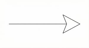
Arrow
Connects symbols to show the direction and sequence of steps.
An arrow pointing from “Start” to the first “Process” box
Input/output
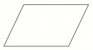
Parallelogram
Represents data or materials entering or leaving the process.
“Invoice received” (input) or “Tracking number generated” (output)
Document
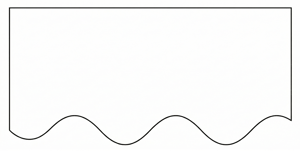
Rectangle with wavy bottom
Indicates a report, email, or physical document is generated.
“Monthly sales report” or “Printed shipping label”
Delay
D-shape
Shows a waiting period where no activity occurs.
“Wait 24 hours for approval” or “Queue for processing”
Examples of process map templates
The detailed process map, value stream map, and swimlane diagram are among the most widely used types, each suited to a different purpose. To help you get started, I’ve pulled examples from some of our top-ranked project management platforms that you can use right away, along with a short guide on how to apply each one.
1. Smartsheet: Detailed process map

This detailed process map works best for operational processes that involve reviews, rework, or conditional approval. The diagram uses standard flowchart symbols: rectangles indicate tasks, diamonds show yes-or-no decisions, and parallelograms represent inputs or outputs.
Decision diamonds drive most of the movement, either sending the flow back to an earlier step or advancing it depending on the outcome. When the answer is No, the process returns to a prior input or processing step.
A single decision can affect multiple downstream activities, and the same output can feed more than one path at the same time. The process only closes after a final decision confirms that all conditions have been met, making completion dependent on criteria rather than sequence.
How to use a detailed process map:
- Begin by defining the process name and identifying who will analyze it.
- Define each decision point as a yes-or-no question and place it in a diamond.
- For every answer, trace the path to the next step, input, or document requirement.
- Add feedback loops when a task may require rework or review.
- Once all stages are mapped, review the flow with stakeholders to verify that each transition reflects real operations and that no decision point leads to a dead end.
Quick tip: Smartsheet provides process map templates in Excel format for different workflow types. You can download a preferred template and edit it to match your workflow and project requirements.
2. Miro – Value stream map
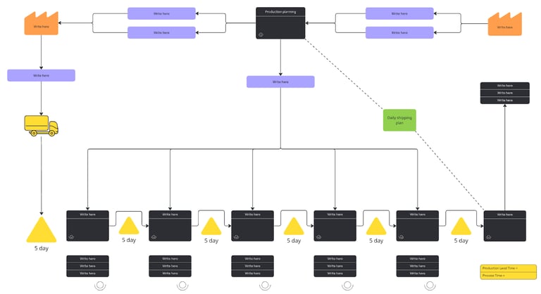
This value stream mapping template works best for tracking how production and logistics activities contribute to overall lead time and efficiency. It maps each process in manufacturing or service delivery, from planning and sourcing through to final shipping. The goal is to expose inefficiencies between stages and how timing affects the value delivered to the customer.
The map uses a horizontal flow to connect two distinct layers. The top portion covers data movement and coordination activities, while the bottom tracks physical work such as transport, waiting, and assembly.
Miro’s template adapts some traditional symbols: boxes represent production or information stages, while triangles and icons mark inventory or waiting periods. The timeline at the bottom quantifies delays and processing time so teams can assess total lead time at a glance. Arrows and dotted lines indicate feedback paths such as daily shipping plans or production updates, and this separation of planning from execution makes it easier to pinpoint inefficiencies in scheduling or logistics.
How to use a value stream map:
- Start by mapping your current workflow, beginning with suppliers and ending with customer delivery.
- Add process boxes for each key stage, noting the duration and waiting time below them.
- Use icons to mark storage points, transport steps, or decision nodes.
- Document the information flow above the main process to capture coordination or communication links.
- Once the map is complete, calculate the total lead and process time, then review it with your team to identify areas that cause delays or unnecessary inventory buildup.
3. ClickUp – Swimlane diagram
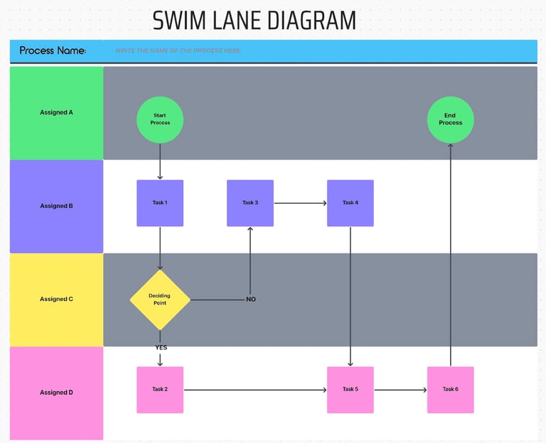
This swimlane diagram template works best for visualizing processes where multiple teams or individuals share responsibilities across different areas. Each horizontal lane represents a specific stakeholder or team, and vertical movement shows how tasks progress through the workflow.
Shapes within each lane display activities, decision points, and outcomes, connected by directional arrows that show how work moves between roles. When a decision produces a yes or no outcome, ownership shifts from one lane to another, which makes it easier to spot where accountability issues tend to occur.
ClickUp uses circles to mark the start and end nodes that define process boundaries, while looping or redirecting arrows highlight recurring reviews or approvals. The overall structure reveals how collaboration flows across departments and where handoffs happen most frequently.
How to use swimlane process map:
- Start by assigning each lane to a specific person or department.
- Add process steps as rectangles and use diamonds for decision points.
- Draw arrows to connect steps, ensuring the direction follows how work actually flows between participants.
- Label conditional paths where decisions split outcomes.
- Once complete, review the diagram with stakeholders to confirm that each task is assigned correctly and that transitions between lanes reflect real workflows.
4. Confluence – SIPOC (Suppliers, Inputs, Process, Outputs, and Customers)
This Confluence SIPOC template works best for defining and communicating the core structure of a process before moving into detailed mapping or analysis. It features a top-level view of how value moves through a workflow by connecting five elements: suppliers, inputs, the main process, outputs, and customers.
Project teams often rely on this format during project initiation or improvement planning because it clarifies process ownership and scope without getting into individual tasks. It follows a left-to-right sequence that reflects cause and effect, with each column playing a distinct role: suppliers provide inputs, inputs feed the process, the process generates outputs, and customers receive them.
This structure helps teams identify missing or unnecessary connections and prevents overlap between roles and responsibilities. The straightforward layout gives a common reference point for what each stage contributes, which reduces ambiguity and sets a stronger foundation for later process refinement.
How to use a SIPOC process map:
- Start by defining the process name and purpose.
- Fill in each column beginning with suppliers and inputs, then outline the main process steps in the center.
- Move to outputs and identify the customers who receive or depend on them.
- Review the completed SIPOC with relevant teams to confirm that every link between input and output is valid and that all key participants are accurately represented.
Use this template
How to create a process map
Aside from using pre-built templates, creating your own process map from scratch lets you tailor each element to your team’s workflow. Doing so helps you capture how work actually happens within your project and makes it easier to uncover gaps that templates might overlook.
Step 1: Define the process scope
Identify the process you want to map and determine its start and end points. Setting clear boundaries prevents scope creep and keeps the focus on the most critical activities.
Step 2: List all the steps involved
Gather input from the people who perform the work and document every action in sequence. This ensures the map accurately reflects how the process functions in reality.
Step 3: Identify roles and responsibilities
Assign each task to the correct person or team involved in the process. Doing this clarifies ownership and highlights where collaboration or handoffs occur.
Step 4: Choose the right symbols and layout
Use standard process mapping symbols to represent actions and outcomes. Connect them with directional arrows to show how information or tasks move from one step to another.
Step 5: Validate with stakeholders
Review the draft map with team members and decision-makers. Ask for their feedback to clear up confusion and ensure everyone understands the workflow.
Step 6: Analyze and refine
Look for redundant steps or delays that affect the flow. Adjust the process map to reflect improvements, then finalize and share it as the official version for team use.
FAQs
A process map presents a complete workflow that includes people, inputs, and outcomes, while a flowchart focuses on the specific sequence of steps or decisions within that process.
Miro and Smartsheet are among the best tools for process mapping because they offer a range of template options with built-in collaboration features. These capabilities make it easy to tailor your mapping needs while keeping every participant involved and ensuring updates reflect real-time changes.
Start by defining the process boundaries, then list each step and assign roles. Use symbols to represent actions and decisions, connect them logically, and review the workflow with your team for accuracy. Using a process mapping template simplifies the process by providing a visual framework to organize and adjust each element.
A good process map uses logical connections that make the workflow easy to follow and interpret. It highlights essential tasks and decision points while keeping the layout simple enough to reveal how work moves between people or departments.