SHARE
Facebook X Pinterest WhatsApp

What is a Pareto Chart? Definition, Examples & When to Use

KEY TAKEAWAYS What Is a Pareto Chart: Definition, Importance, and Uses A Pareto chart is a unique form of bar graph that highlights data in descending order, with the most significant datasets on the left and decreasing values on the right. Project management teams frequently utilize Pareto charts to visualize data and maximize positive work…

Written By
thumbnail Lauren Good
Lauren Good
Published: Feb 28, 2024
Updated: Jan 29, 2025
project-management.com content and product recommendations are editorially independent. We may make money when you click on links to our partners. Learn More

KEY TAKEAWAYS

  • A Pareto chart is a data visualization tool used to highlight the most significant project issues by ranking data in descending order, helping teams prioritize effectively.
  • Using Pareto charts saves time by tackling major issues first and simplifies communication with stakeholders.
  • By identifying high-impact problems, Pareto charts allow for a more informed decision-making and efficient resource allocation.

What Is a Pareto Chart: Definition, Importance, and Uses

A Pareto chart is a unique form of bar graph that highlights data in descending order, with the most significant datasets on the left and decreasing values on the right. Project management teams frequently utilize Pareto charts to visualize data and maximize positive work outcomes.

Pareto charts are primarily used to help teams identify the most significant data in a data set, allowing teams to focus on the data that will enable them to have the most substantial impact. In short, the Pareto chart functions in two key ways: by visualizing datasets and concentrating the most important data first. The Y-axis, the vertical axis on the furthest left, represents the frequency of specific data. The X-axis, the horizontal axis on the bottom, shows the categories. 

Pareto charts are data visualization tools that any project management team can find useful as part of their decision-making toolbox.


READ MORE: What is Project Management?


Pareto chart example.
Example of a Pareto chart showing issues tracked during a product launch. As illustrated, lags and bugs were the most significant issues.

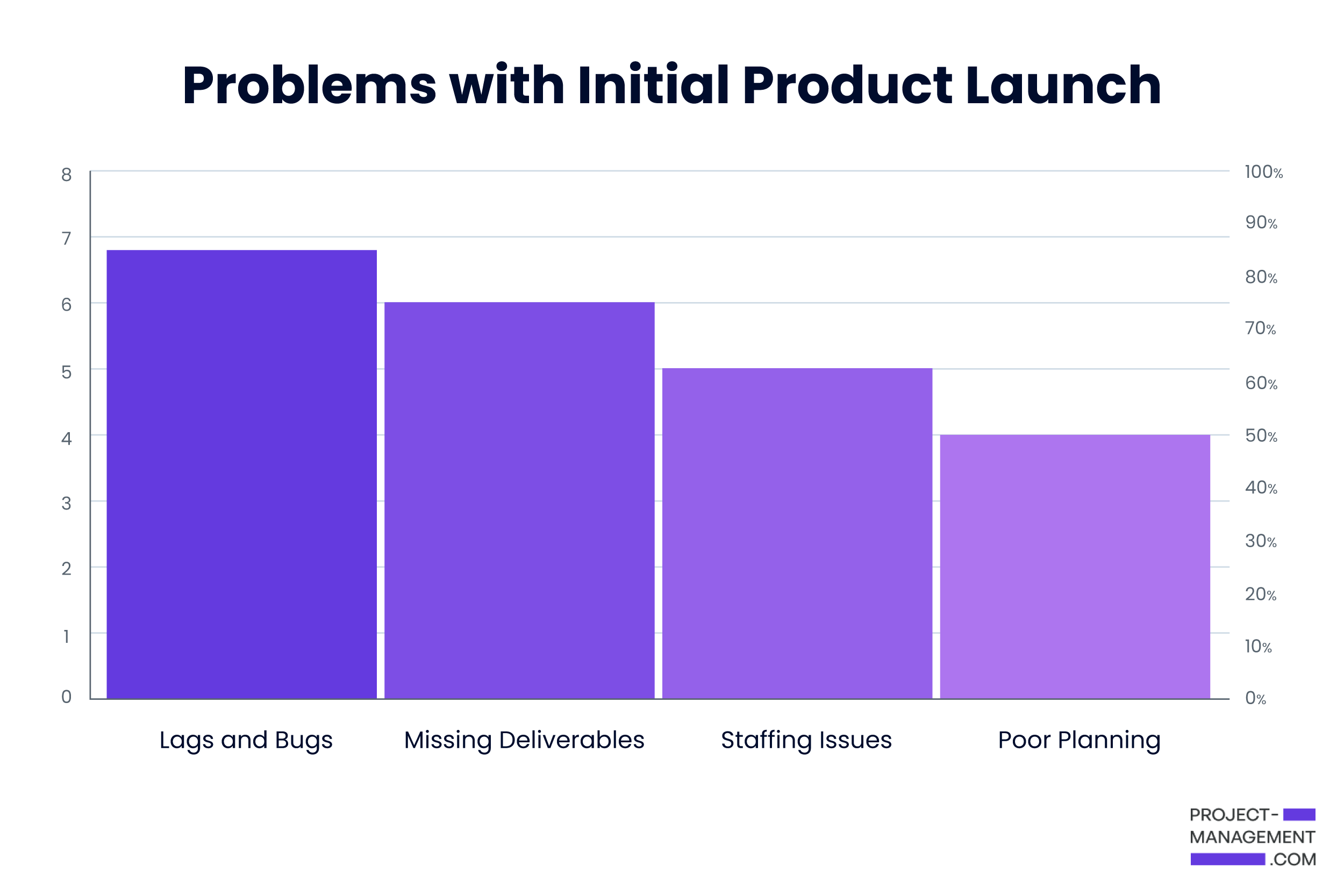
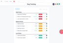
One of the most crucial traits for a project team to have is the ability to look at the big picture and prioritize the most impactful tasks or issues. The project management concept of a Pareto chart revolves around helping teams quickly identify the most impactful area of the data set to prioritize first, as shown in the example above. What’s more, teams can leverage the smaller and less significant data sets to explore what areas require less attention. 

How to Create a Pareto Chart

If you’re looking to utilize the power of a Pareto chart for your team, creating one is much easier than you think. 

  1. Decide on a data set to compare within your Pareto chart (project problems, progress, causes, etc.).
  2. Identify the problems or issues within the data set you’ve chosen.
  3. Arrange the data in descending order based on significance/impact to make it easier to arrange in a chart.
  4. Manually input the data into the chart or use a Pareto chart generator tool to visualize the data. 

READ MORE: What is a Requirements Traceability Matrix (RTM)?


Benefits of Using a Pareto Chart?

A Pareto chart is a useful tool that any project management team should keep in their toolbox. Here are few of the top benefits of using a Pareto chart:

  • Easier visualization of data
  • Saves time for busy teams that need to tackle the biggest issues first
  • Helps focus teams on the most important metrics 
  • Makes it easier to relay important data to stakeholders

READ MORE: What Is a RACI Matrix?

FAQs

Also called the “80/20” rule, the Pareto rule is premised on the idea that 80% of a project’s benefit can be achieved by doing 20% of the work, highlighting the fact that inputs and outputs aren’t balanced. The principal outlines the idea that 20% of causes cause 80% of outcomes.

Categories, factors, frequency, percentage lines, baselines, and problems are just a few of the types of data that Pareto charts can measure. This can be used across numerous industries to help identify impactful trends in datasets.

While Pareto and bar charts may appear to be the same based on appearance, a Pareto chart shows data arranged from high to low, whereas bar charts highlight datasets without organizing them in any specific order.

thumbnail Lauren Good

Lauren Good is a staff writer and project management expert for project-management.com Previously, she was a communications consultant, managing hundreds of projects while providing 20+ clients with strategic planning and content strategy across the information technology, cybersecurity, SaaS, and cannabis sectors. She is a graduate of the Forbes-Accredited Business Core Program at Miami University and holds a bachelor’s degree in public relations from Kent State University. Connect with Lauren on LinkedIn.

Recommended for you...

Leadership in Project Management: Why It Is an Essential Skill
Technical Project Manager (TPM) vs Project Manager (PM)
Bradon Matthews
Oct 15, 2024
How AI Is Changing Project Management: Uses, Impacts, & Trends
Bradon Matthews
Sep 27, 2024
Elements of Risk Management: Everything You Need to Know
Matt Klein
Sep 9, 2024
project-management.com Logo

project-management.com is dedicated to providing modern tools, latest news, and best practice references for every project professional and business organization. The discipline of project management has continued to receive growing interest and attention over the past decades. Especially today, the importance and relevance of the project manager for any kind of undertaking is unquestionable. However, the challenges of modern society, business relationships and latest technology are also testing their competency and ability to deliver successful projects. Since its launch in 2001, PMcom has been featuring pertinent articles, management software and productivity tool reviews, books, interviews, training sites and other e-learning resources to help people be more productive and successful in their chosen path.

Property of TechnologyAdvice. © 2025 TechnologyAdvice. All Rights Reserved

Advertiser Disclosure: Some of the products that appear on this site are from companies from which TechnologyAdvice receives compensation. This compensation may impact how and where products appear on this site including, for example, the order in which they appear. TechnologyAdvice does not include all companies or all types of products available in the marketplace.